
This has been the year for me to update my logo, branding, and tweak how my marketing looks. Read how I made it look more sophisticated.
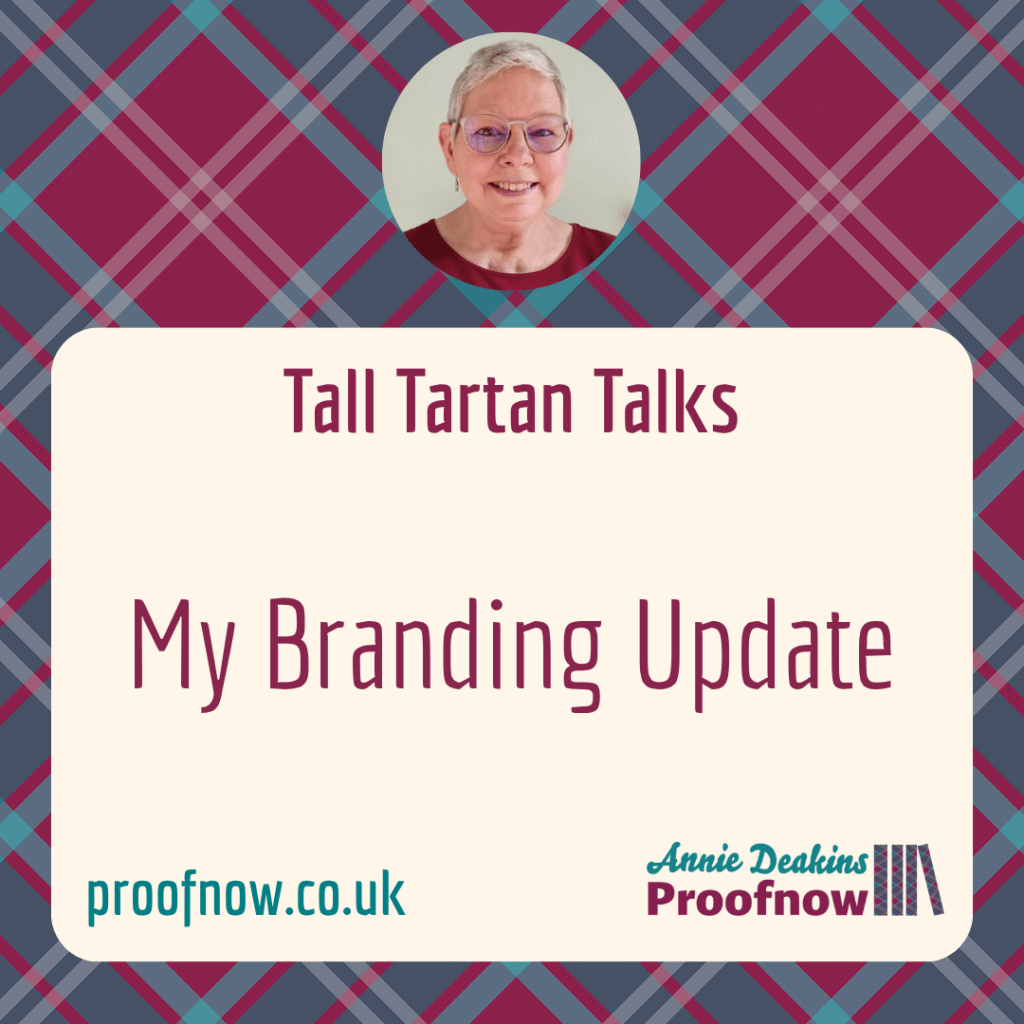
Tall Tartan Talks here … My last branding update for my freelance proofreading business was in 2020. That was when my tartan banner, designed by a colleague, appeared for the first time. You can read about it in this post My Branding Process.
Within that post you will find Websites and Marketing where you will read my first thoughts back then about how you should show yourself as someone who is trustworthy and can bring value. (These links are repeated at the end so that you can continue to read on here.)
Becoming established
When I upgraded in my professional Institute and could display my new membership level, I wanted to celebrate and invest in a new business logo.
Updating branding
Do you have a business logo?
The first one I created was in Canva (design app).
I knew that a designer would give it a more professional feel.
Designing new logo
I commissioned a specialist called Berenice Howard-Smith, MA of Hello Lovely Design & Co. I know her work well. We have a good working relationship.
She reassured me that, once your business is established, a designer can take your values onboard with a better idea about how to represent your brand. She asked what services I would continue providing and how I would take my business forward? What elements did I want to have integrated into the logo design? How to future-proof the logo, in other words. It made me reflective and firm about the services to continue and develop, and what to stop.
In our discussions, Berenice used the word ‘sophisticated’ to describe how she would update my brand identity now that my business is more stable and established. I’ll go with that!
Although, outwardly, my logo hasn’t changed apart from having my full name, it represents the internal discussion I had with myself, listing pros and cons, sparked by the questions Berenice posed about my business.
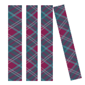
I love my tartan books.
Changing image
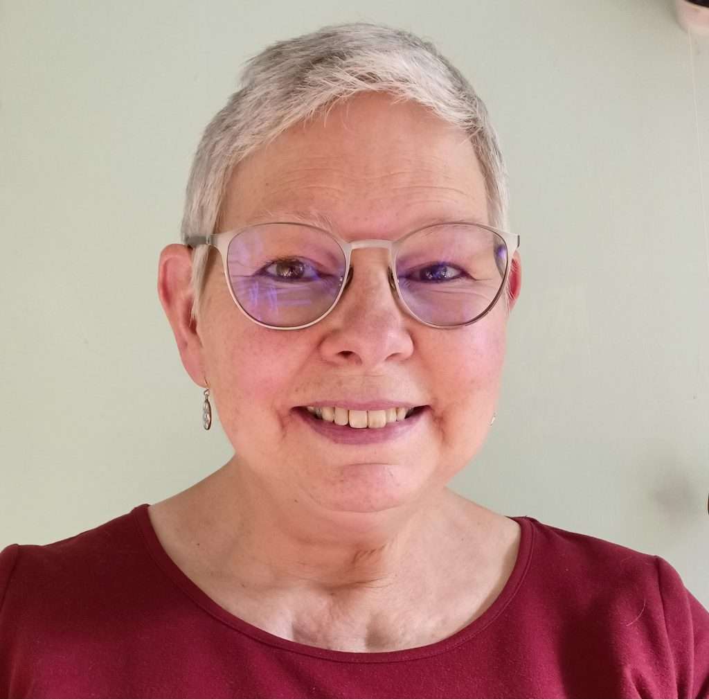
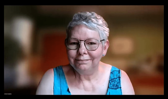
Discerning the direction of my proofreading business, I decided what services to continue and what to chop and stop. This included having a hair chop because I wanted a change.
My branding reflects my new photo.
The last time I had the pixie look was when I was teaching over 10 years ago. One colleague said, “That’s how I remember you!”
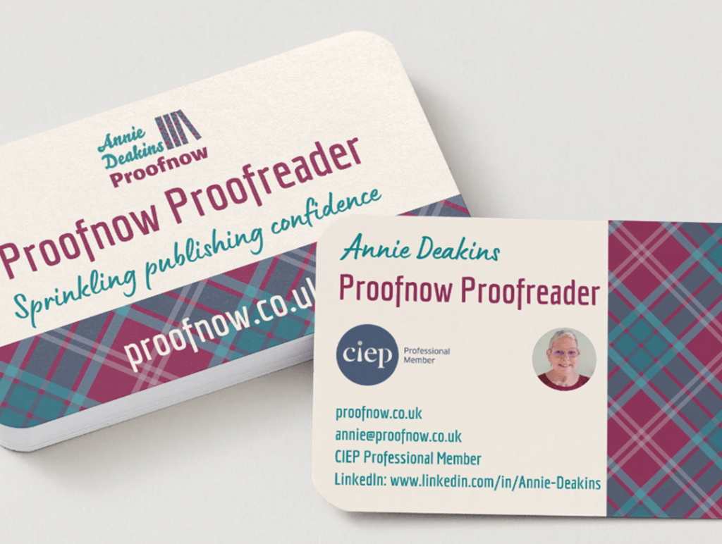
Printing business cards
I put all my branding design elements together into printable business cards. Canva Pro gave me a good deal to upgrade and use the advanced design options.
I use the cards for when I am networking or just chatting to people I meet about what I do.
Here they are – ta-da!
Filming a video
The next step was to update the video of my website tour which is in the footer of my website with a shareable link for my socials. It is another way to show my personality, branding, and establish trust. To stick in people’s minds; to remain visible.
Here’s the YouTube link to watch it.
Marketing everywhere
I have posted all the elements of my marketing that I list here in the Featured section of my LinkedIn profile. That’s another tip for you. It acts like a CV and is an easy place for users to check your services. It reinforces your visibility.
Turning to you
To finish, here’s my top tip about basic branding and marketing: make sure the branding on your website is up to date and reflects your current services. Ensure your branding matches that on your social media channel/s.
It is true that updating a website never stops, but having a website is the first step in marketing your services.
What changes have you made or need to make to your branding?
Sprinkling publishing confidence,
Annie


Further reading
Blog posts linked in this post each time I updated my branding:
My Branding Process (2020)
Websites and Marketing (2019)
Emailing
Email to check my availability for proofreading non-fiction and children’s books.
Subscribing
Subscribe to my blog to receive new posts directly to your email.


